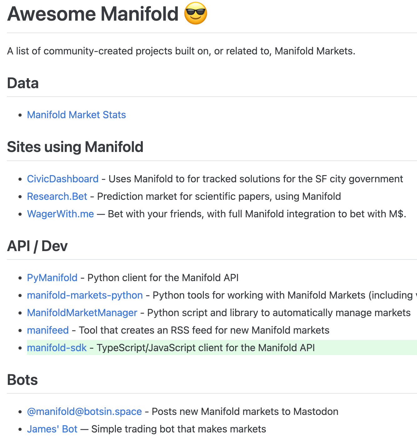
One of my favorite things about Manifold is the creativity and depth of community contributions. We've curated a few of them on Awesome Manifold (check out the cool stuff there!) But it's been a while since we updated the page, so I'd love to hear about any projects we may have missed out on...
Some categories of things that we're always excited to see:
Writeups/deep dives into the nuts & bolts of prediction markets -- especially now that you can natively embed Manifold into Substack!
Data visualizations of how markets perform (eg wasabipesto's stats are so good we couldn't help but include them on manifold.markets/stats)
Different kinds of code integrations, SDKs, and bots that make use of our API
Fanart! Manifold is so text-heavy, I'd love to see more visual flair and graphic expression haha.

(from @hamnox)

(from @wasabipesto)
I'll be tipping M$100 for each new submission that we end up adding to Awesome Manifold (note, this is just a finder's fee, separate from any bounties we choose to award!)
Market resolves equally to all entries that we end up listing~
🏅 Top traders
| # | Trader | Total profit |
|---|---|---|
| 1 | Ṁ1,425 | |
| 2 | Ṁ201 | |
| 3 | Ṁ15 |
People are also trading
@Austin my favorite dishonorable resolution thus far. xD
Misclick happens.
Do you think this highlights an issue with the UX for resolving multiple choice markets, or was it more of a derp moment? The few multiple choice markets I've resolved, I've definitely had to squint at the screen for a few minutes to make sure I'm doing it right.
@MattP One part UX issue, one part "you should really be able to fix/re-resolve/undo resolving a market"
@JoshuaBrower Nah, if it's anyone's fault it's mine (or mostly, the Manifold app's fault - I believe in blaming systems not people)
If anyone feels slighted by this resolution, please post a comment with the amount you would have won, and I'll tip you to compensate
@Austin Yep, agree with being able to fix/undo mistaken resolutions, I had a market on that for August and just made a follow-up inspired by this:
@Austin I'm of two minds about the undo issue. It seems like it'd be really difficult to actually implement in a way that might not make people really mad, as you're talking about removing winnings from peoples' accounts after they were deposited.
I'd lean more towards better resolution UX - like an additional pop-up "are you sure?" that displays both the question asked and the proposed resolution so market makers can read it all together instead of having to scroll up to the top and back down to click the correct resolution.
@Spindle if you post a good writeup about your studiez, I'm game to link to it from Awesome Manifold~
