Current location:
 1,000
1,000People are also trading
Why not just make it a setting that you can change?
Same for the DMs, why not make it so that they can be disabled for those like Eliza who hate them with passion
@Velaris While I'm not working for manifold - making everything a setting significantly increases development and testing costs.
@JamesGrugett @traders don't listen to James, this was all his fault from the start!!! Ignore ignore ignore.
I do have another entirely different UI suggestion topic: https://discord.com/channels/915138780216823849/1455645725315567637
Not sure if it will have a wide-reaching appeal to the masses, but it's certainly an upgrade if it were to happen.
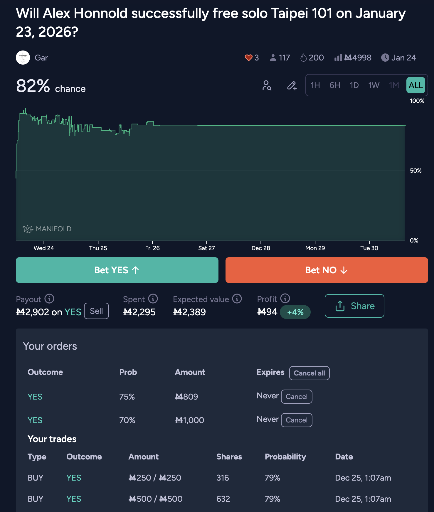
@Quroe back in the good old days, the "your trades" section was another tab next to comments. They moved it up higher in a misguided attempt to "show people what they bet on" even though:
Your share type and amount is already there
Vertical space is very important
The box where it is now covers up all the space making it hard to find the description and comment section
It doesn't actually show the data in a useful way
It takes up a ridiculous amount of space
NO ONE would find this box more important or interesting than the market description and comment section
@Eliza I think whatever method reduces friction most for newer users is the higher priority. I'm generally aligned with your views here.
One option for 'Other' is to have it totally hidden until you click something. But it just doesn't belong in this area at all. It covers up a huge amount of important real estate on the screen, preventing users from seeing the market description and comment section.
It was a mistake to put it there in the first place, it's still a mistake today.