
Nick Bostrom is coming out with a new book, and is requesting ratings of book covers from visitors to his site. You can take the survey here: link
Resolution criteria:
This market resolves to whatever book cover is chosen for the book, or to "Other" if a different cover is used. Altered but recognizable versions of the five proposed covers will still count for resolving the choice.
See also:
/singer/will-bostroms-new-book-depict-a-bir
/singer/will-bostroms-new-book-depict-sisyp
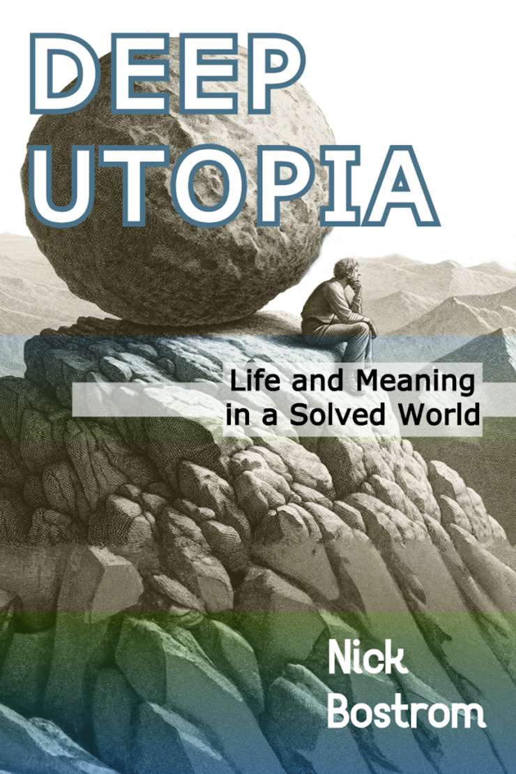
Option 1
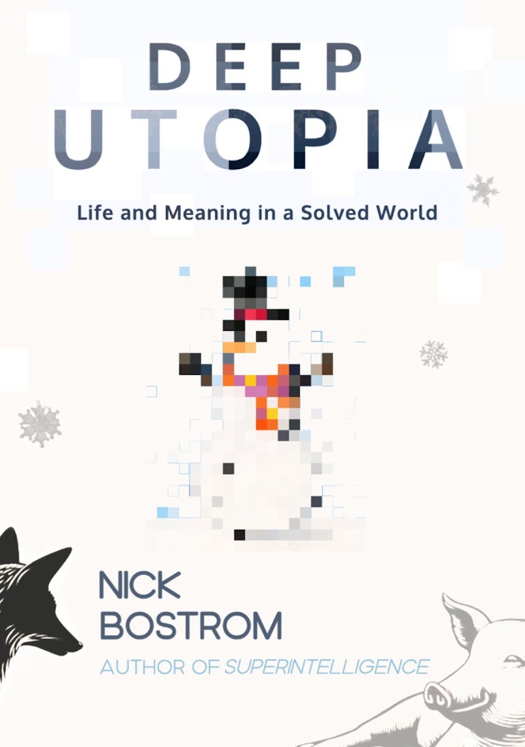
Option 2
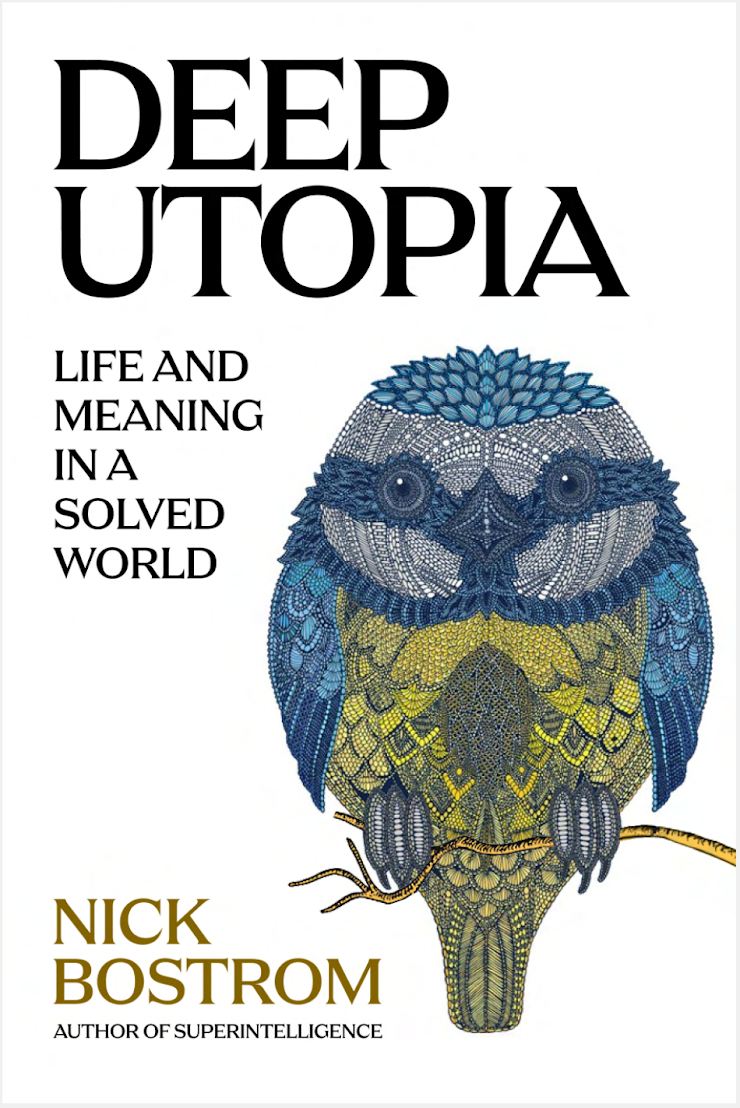
Option 3
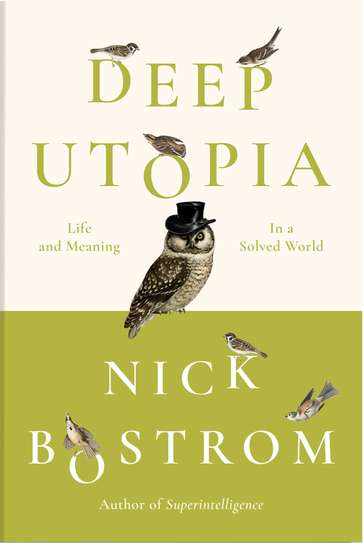
Option 4
Option 5

Disclaimer:
I am not affiliated or known to Nick Bostrom in any way. He did not request me to make this market.
 1,000
1,000🏅 Top traders
| # | Trader | Total profit |
|---|---|---|
| 1 | Ṁ719 | |
| 2 | Ṁ450 | |
| 3 | Ṁ220 | |
| 4 | Ṁ197 | |
| 5 | Ṁ125 |
People are also trading


@singer I put a bet on that cover earlier today, but I think the market should wait until it can actually be purchased, as there’s a chance it may change.

@singer I personally find the monochrome a bit better. It justifies the premise by evoking ennui, and it feels more appropriate to a work of academic philosophy.
The only thing is that I think I like the toga in last one more than the more modern garb in the first - I didn't immediately draw the Sisyphus connection and I think the toga would drive it home.
@singer in 5 he's sitting awkwardly on top of the boulder and that's obviously a mistake, he's going to hiccup and then get flattened as it starts down the hill again.
Also in 5 we can't see his face, he's looking the wrong way.
@justifieduseofFallibilism apparently we don't live in a solved world, given the poor state of the book's cover
@33cb I think it would still be Sisyphus 1 as long as that is the starting image that was taken and modified. If the artist draws a Sisyphus 3 which combines both of them stylistically that would be Other
@MartinRandall I see, had no idea that was possible. I'm adhering to using Other for stylistic splits, but I'll keep that option in mind.