The cranes shirt would be a smaller batch (for volunteers and maybe night market) and the text and radial would be a for everyone sized batch (includes the sponsors names)
 1,000
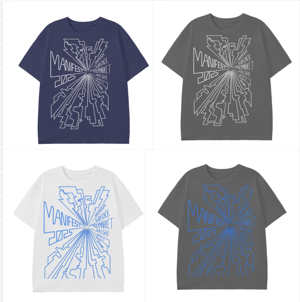
1,000I like the radial design! And I like the cranes design on the front of the volunteer shirt!
I also feel very strongly that the volunteer shirts should not be tan or navy blue. They need to stand out, otherwise what's the point? Many people will be wearing those colors, especially if the main Manifest shirt is also those colors, just with a different design. You might as well have volunteer badges at that point. It should be very easy to find the volunteer in the crowd, so e.g. when a speaker shows up to a room it's obvious who the room manager is. (Maybe this is already the intention, you're just demo'ing the images on simple colors. But just wanted to flag in case it's not.)
@rachel yes this was mostly to demo the image but hearing how volunteer shirts work in function is also helpful, feel very warmed whenever you share advice!