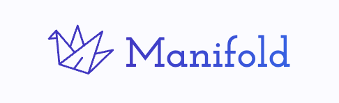
We're thinking about de-emphasizing "markets" in our branding, aka mostly going from "Manifold Markets" to just "Manifold". As part of this, we're also thinking about changing the fonts used in the logo.
Here's one mockup using Josefin Slab (which is currently used by http://manifund.org/)

Resolves to the name of the primary font used by the logo, at market close
 1,000
1,000People are also trading
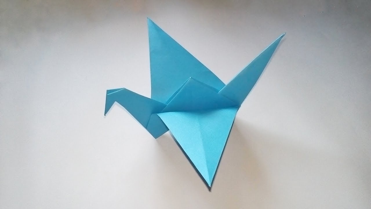
have you considered remaking the logo? it’s currently a “flapping bird,” not a crane — a crane design is a lot more sleek, but they’re very similar
(difference is an extra valley fold in between the square base and the bird base)
flapping bird (current manifold logo):
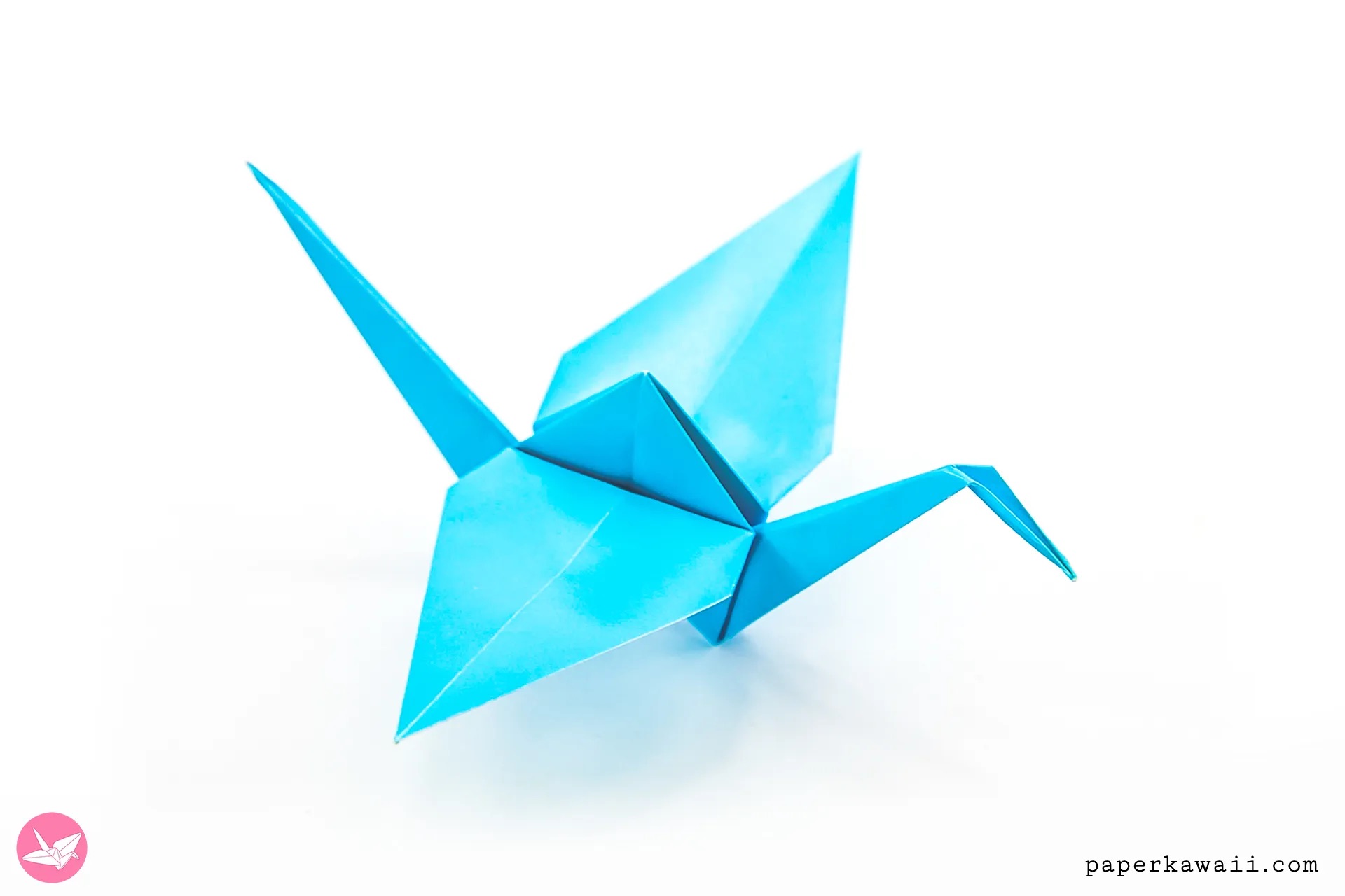
crane:
@saulmunn although looking a little bit more closely at the logo, I’m not even sure it’s an actual finished fold, lol — just seems closer to a flapping bird, than a crane
@Austin I really like it! Especially if you adjust the crane line width to match, which should be easy if it's SVG or you remake it as an SVG. The Figtree one looks too much like Arial to my eyes
@Austin This is the current font; it looks kinda cool, especially capitalized (which is why I picked it way back when we were Mantic Markets), but can be hard to read esp from a distance, and isn't great for making swag.