Resolves to whichever object is the most edifying in my subjective opinion. The more specific the better.
I will not bet on this market. Ask for clarifications in the comments.
 1,000
1,000@ZZZZZZ I mean, fair, and I had fun, but surely more specific than the internet, which contains most maps, and the universe, which contains most things :p
@Duncan I didn't go with this because I don't know how it's possible for me to talk to myself from ten years in the future.
@SusanneMM Sorry, this was meant to be in response to your specific answer of a paper map of historical and current trade routes, not to your comment here, my bad!
To expand on the maps thing, maps display extremely dense informational loads in ways that can (from a good map) be intuitively grasped, and allow the reader to make myriad connections that they couldn't from just reading the individual data. Maps not only display data, they contextualise it. And that's even before starting to expand from purely geographical maps to the wide variety of conceptual mappings that not only communicate, but clarify, information
@ZZZZZZ I guess in my original idea, I was thinking that for any given area of desired edification, a map would be a tool perhaps most often useful, but a different map in each case. In the same way that if someone had suggested 'dictionary', that would imply going to the relevant section for any query, I think the relevant map for an edification would in general be efficient and effective.
Even trying to pick a specific map, I could suggest a map with the most data density (perhaps with a combination of colour, texture, geographical, size-based and 3d encoding), but trying to do that I keep coming back to what I think is the real beauty of maps - that they are a great way to answer questions (even fairly broad ones), and so the relevant map depends on your question. But that given a question, a map is often a good starting place
@SusanneMM I could imagine using a map for climbing a mountain or something like that, but what kind of edifying maps exist?
@ZZZZZZ so a classic topological map can tell you the best hiking routes, but it can also show you the history of the land - the types of terrain indicate how it was formed, and from where - what was carved by glaciers, what by rivers. Overlay, say, geological information, and you can deduce a lot about the history of an area. But take it beyond that. Overlay lead content in water with crime statistics on a map. Overlay natural resources and rivers with large cities to understand how civilisations were formed. Map out wealth and labour categories, or railway access and innovation, or distance to nearest doctor and maternal health outcomes - maps can efficiently and intuitively show correlations and connections in any field you choose. (The examples there are slightly individually imaginary, but loosely based on hours giving through map books as a child - not just of terrain, but if anything you could think of)
Of course you should always do responsible data handling - for example correcting for population sizes etc!
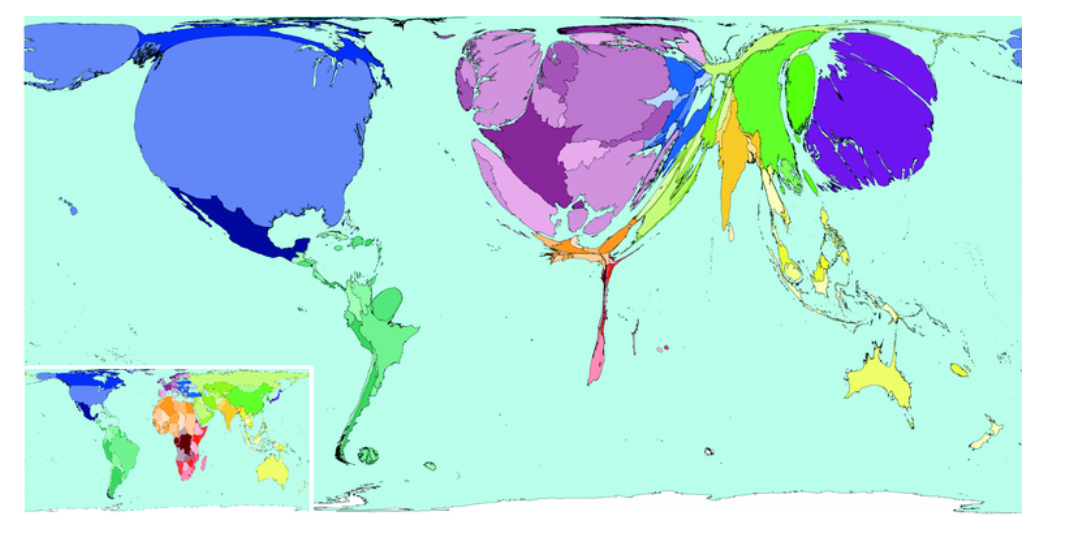
But then even being the geographically precise maps, we can get so creative. Take a map of the world but each country's size is proportional to it's GDP. Or to it's military strength. How effectively the eye is drawn to distortions in what we expect - and it's more memorable (at least for a lot of people) then reading the bare numbers involved in a table
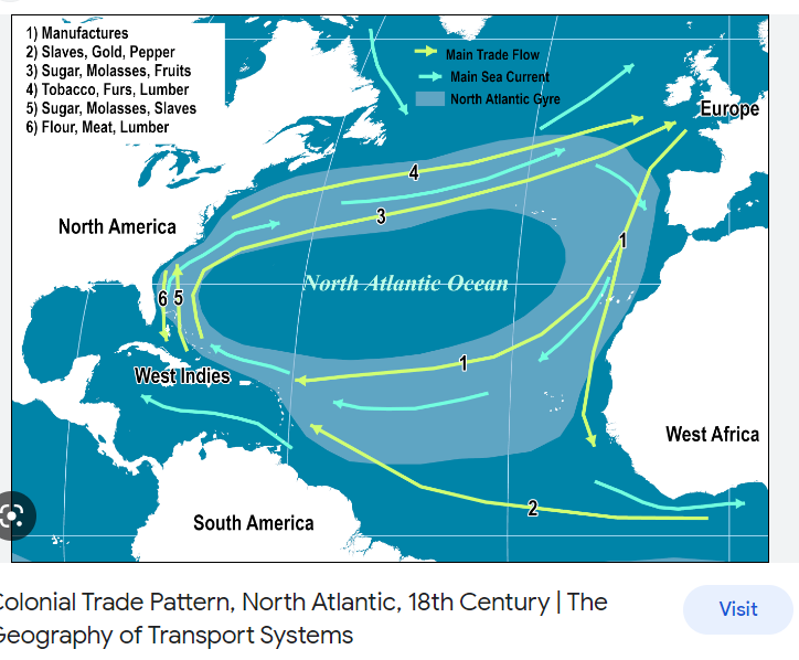
@SusanneMM ooh, like, global trade routes in the sailing age with prevalent winds and currents is a classic
@SusanneMM It seems like it is mainly edifying with respect to getting and displaying knowledge but is knowledge the only thing the most edifying object can provide?
@SusanneMM ok last one for now, etymological maps, showing the flow and change or loan words, also super neat (classic example: tea if by sea, cha if by land)
@ZZZZZZ hmmmm ok so edifying: 'providing moral or intellectual instruction'
I think one of the things that maps really do is provide more than just information, but provide it in digestible and usable chunks - which I think approaches a natural interpretation of 'instruction,'. I guess all the examples I've listed have been pretty intellectual. A facetious answer here would involve maps showing distribution of beliefs or moral systems... But I think maps showing effects of human actions can certainly drive moral lessons home - maybe things like mapping human population vs natural diversity, or using maps to show the effects of colonialism or industry... Or vice versa in positive ways, showing the effects of good initiatives.
@SusanneMM this one's not the one I was looking for, but is a small example of what I meant with the trade routes and currents
@SusanneMM comparative maps always a classic: https://www.tumblr.com/mapsontheweb/706547166195351552/european-capitals-on-the-map-of-north-america?source=share
population information: https://www.tumblr.com/mapsontheweb/706527979741773824/top-three-languages-taught-in-australian-schools?source=share
shape vs actual populaion: https://www.tumblr.com/mapsontheweb/706510362528333824/oregon-population-density-by-mrpecners?source=share
population density in a different way: https://www.tumblr.com/mapsontheweb/706498569591570432/how-much-land-around-a-countrys-largest-city?source=share
economic growth https://www.tumblr.com/mapsontheweb/706440801164607488/half-of-the-additional-gdp-generated-from-2000-to?source=share
(ok that's just a great tumblr overall)
@SusanneMM Also not the exact one I was thinking of, but this is a map of countries scaled to the size of their GDP in 2021