Which Manalinks look do you prefer?
13
Ṁ600Ṁ426resolved Jul 17
100%46%
B.1 Card View (light mode)
7%Other
6%
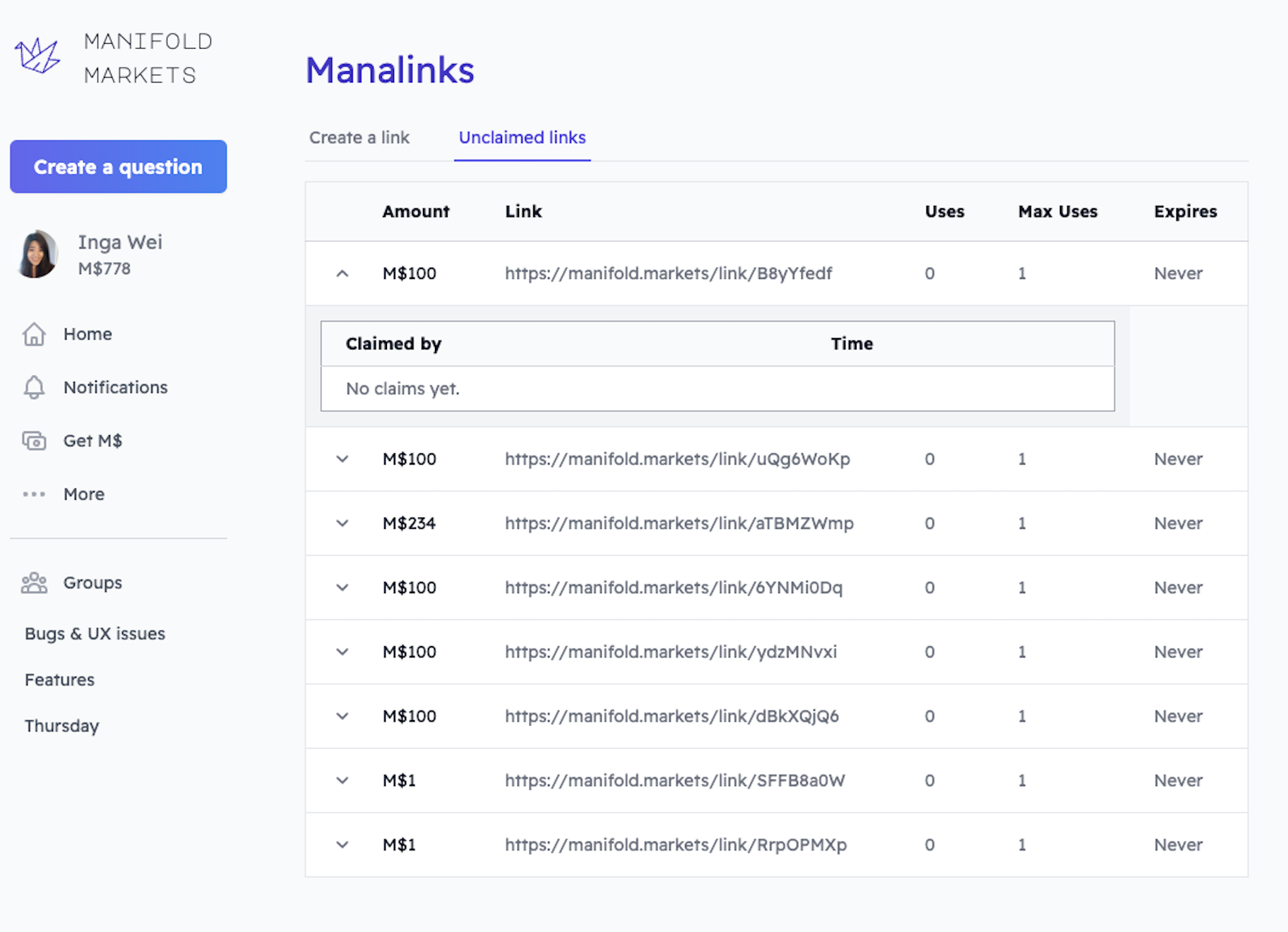
A. Original (table)
1.9%
B.2 Card View (dark mode)
39%
C. List View
I have a couple designs for looking at your manalinks and who has claimed them. Feel free to leave additional suggestions in the comments :)
A. Original (table)
B.1 Card View (light mode)
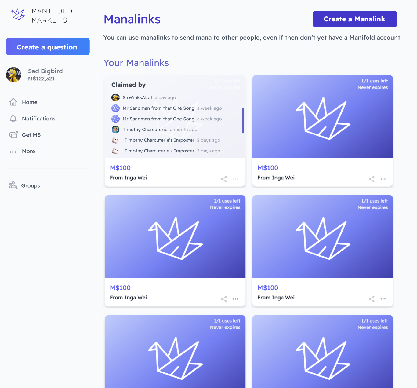
B.2 Card View (dark mode)
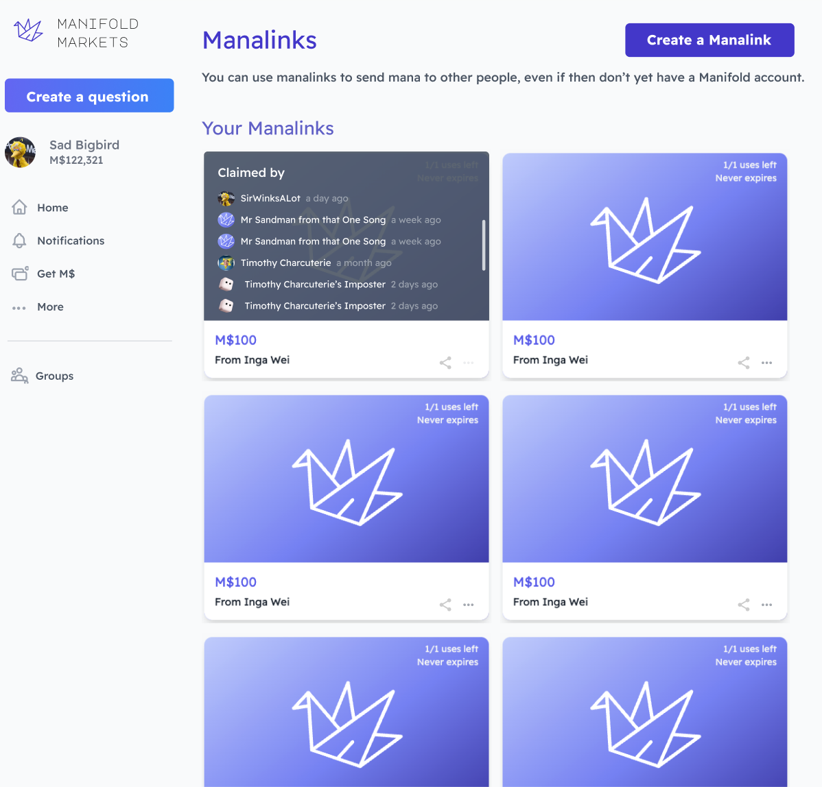
C. List View
Jul 15, 3:04pm:
Added mobile view:
https://docs.google.com/presentation/d/1tuZ_wdrgE6Qj1h0VTNd9DOENkXcVK0ySWnumsqTLTqM/edit?usp=sharing
This question is managed and resolved by Manifold.
Market context
Get  1,000 to start trading!
1,000🏅 Top traders
| # | Trader | Total profit |
|---|---|---|
| 1 | Ṁ257 | |
| 2 | Ṁ37 | |
| 3 | Ṁ2 |
Sort by:
@MichaelWheatley That's fair. I guess my justification for this is I don't imagine people will be making that many manalinks, and I really want to convey the gift card like vibe (generally I think we should sprinkle in more visual variety to different pages so people know where they are). In the future I do want to either randomize or have the user select background colors/symbols so it'll hopefully look less bland.
Another solution is to have them visually stacked (kind of like a rolodex)
I'd love to hear more of your thoughts
@IngaWei i love the gift card looks and think it should be featured. I changed to list because it seems more readable with less wasted space, but I would love for each points to look more gift-cardey
@IngaWei Those are both good points that I overlooked (evoking gift card + likely quantity). If you are in fact able to make the imagery more interesting or informationally-dense, that would absolutely address my concern.
@ian Yeah I tried using chevrons but I think it just looks ugly. One option could be to give those options upon hovering over a section, I originally thought maybe clicking the picture area copies the link and clicking anywhere else shows you details
@IngaWei i like this the most but I think you should be able to just click a list item to expand and see the claims, with something using the chevron icon
@ian It's the '...' on the bottom right that will display it. Open to suggestions if you don't like that though!